Branding
Center for Language Sciences
A unique brand identity combining institutional ties and brutalist modernism to reposition an interdiciplinary center in the language sciences.

Brand Strategy
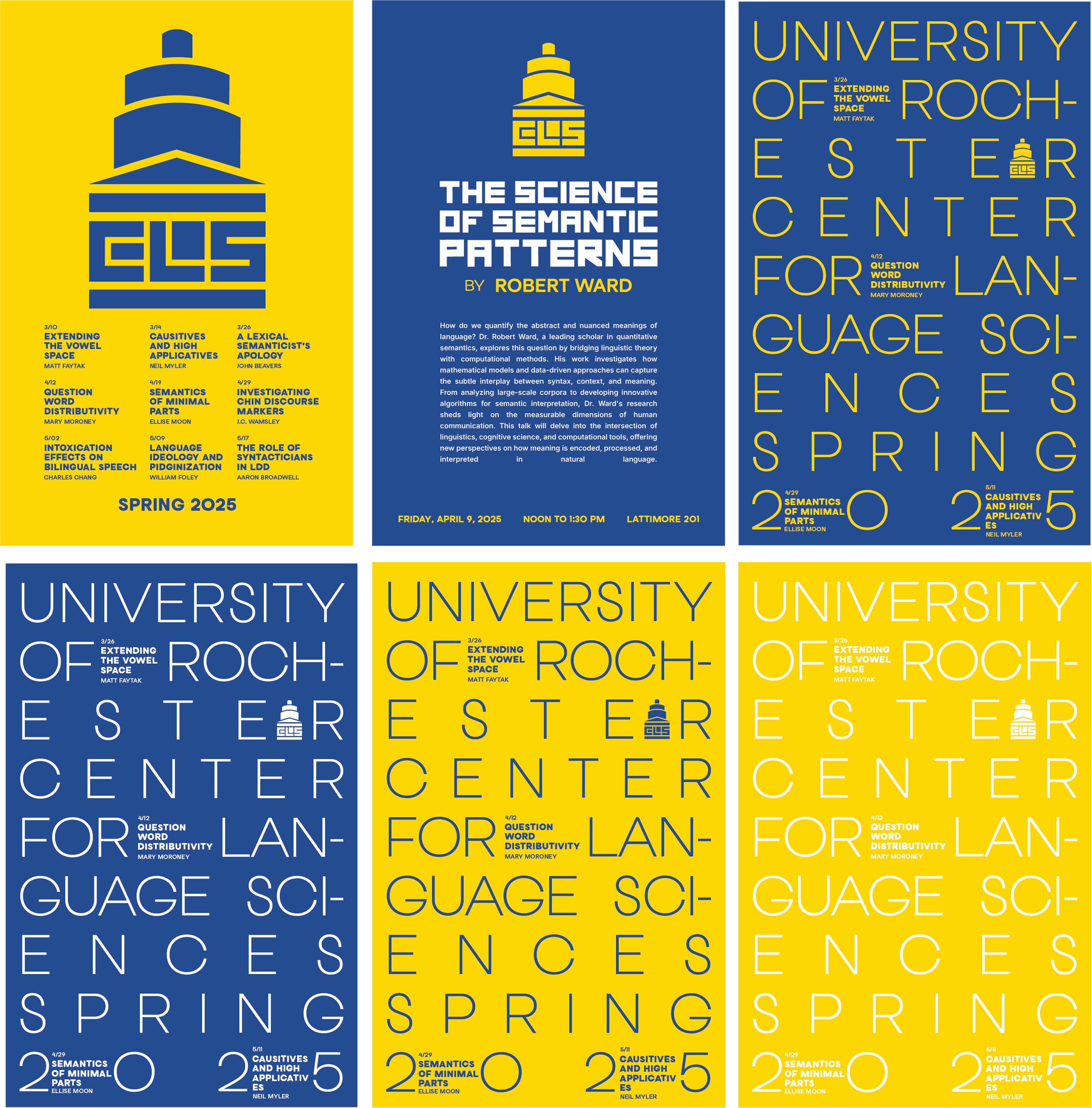
The brand strategy balanced institutional credibility with distinction. The director wanted an identity that felt academic and professional, but not visually absorbed by the university brand. At the same time, the system needed to avoid overt language or linguistic symbolism so it could represent researchers across disciplines. Voice and tone were defined as formal and academic, but never cold. The identity needed to feel human and conversational, supporting connection and dialogue rather than authority alone. These principles guided decisions around typography, hierarchy, and layout, ensuring the brand could communicate rigor while remaining accessible and contemporary.
Logo and Visual Identity
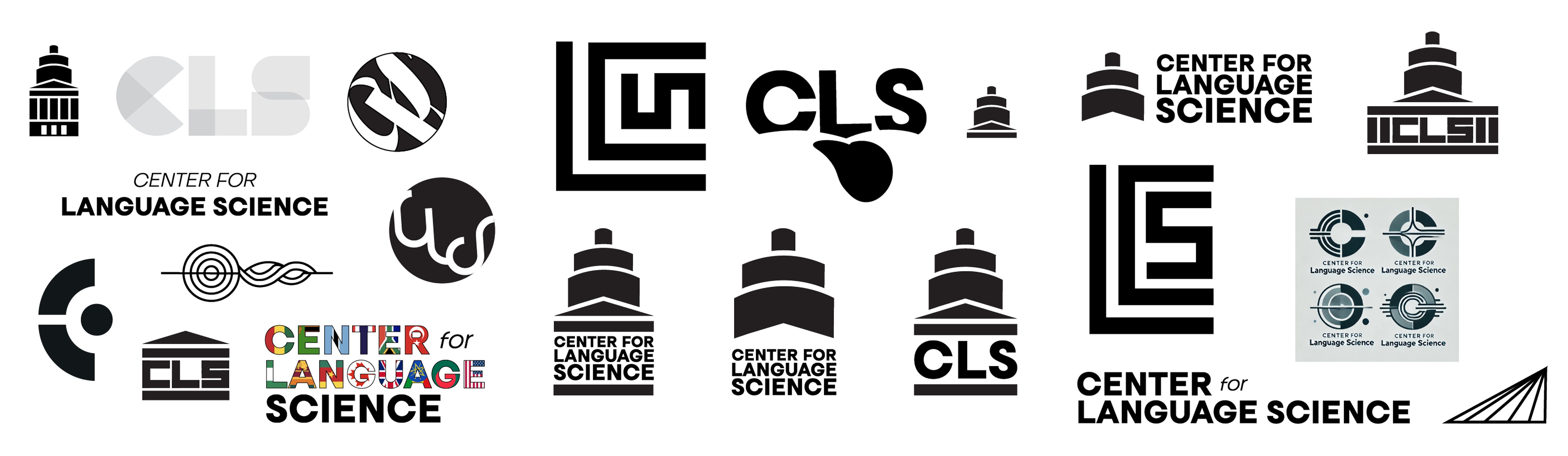
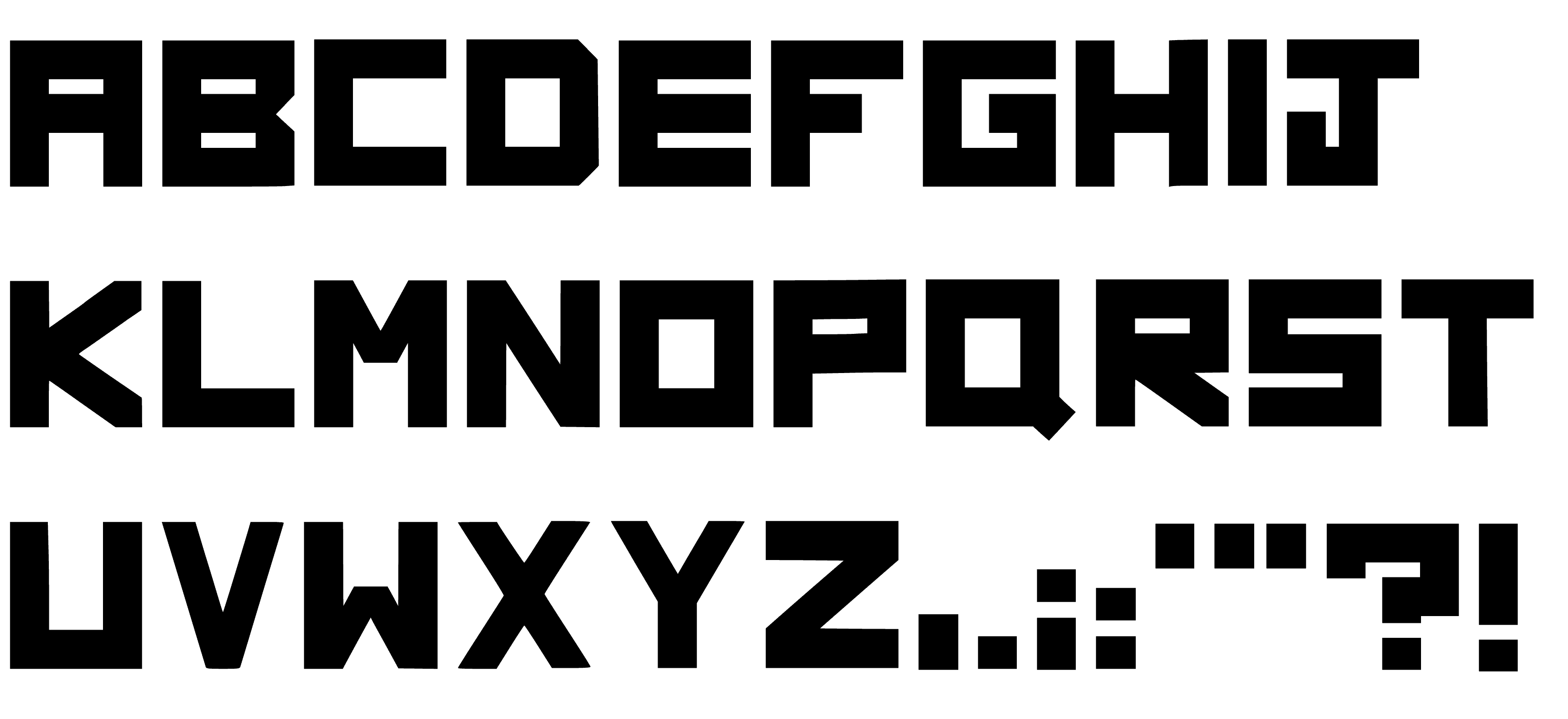
The visual direction drew inspiration from the modern, modular identity systems used by institutions like MIT, particularly the Media Lab. That influence informed a custom typographic approach built from angular, structured forms that feel contemporary while remaining appropriate for an academic context. The icon is a simplified silhouette of Rush Rhees Library, one of the University of Rochester’s most recognizable landmarks. The letterforms C, L, and S are integrated directly into the columns of the building, grounding the identity in place while keeping the mark abstract and flexible. Together, the typography and icon create a system that is distinctive, institutional, and adaptable across digital and print applications.